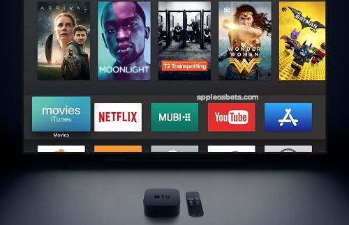
Apple TV users don’t like the new interface. Many Apple users do not seem to like the interface changes introduced to the Apple TV app via tvOS 16.2, iOS 16.2, iPadOS 16.2 and macOS Ventura 13.1: there are several posts published on Reddit through which we complain above all about the demotion of the Next to section inside the Watch Now tab and the addition of a large section of featured content that apparently cannot be disabled in any way.
Apple’s cellular, Bluetooth and WiFi chip not before 2024
Some say they are also annoyed by the fact that the previews also automatically play content with audio. For example, the user who signs himself Sean310 writes that he does not like the new format and the Up Next section, where now “the same Apple TV+ programs occupy 85% of the underlying screen”.
What happened?
When tvOS 16.2 was in beta testing the Featured section used to show above the Upcoming tab, but Apple eventually changed the design so now this tab continues to be visible at the bottom of the Watch Now tab and most of the The interface is occupied by a rotating carousel with shows and movies.
There’s no way to turn off the Featured section or go back to the previous interface that focused attention on upcoming shows. The problem is that this interface change, at least as far as tvOS is concerned, was installed on a large audience due to the Apple TV’s automatic update function (although it’s too late now, here are the instructions to disable them, at least for the future). WikiWiki user tells What:
The same happens to me. My Apple TV updated last night and it was a huge step backwards. It no longer looks like a premium product but rather looks like a cheaper advertising platform. I would like at least the option to be able to go back to the old “Next” view.
Complaints don’t come as a surprise
Users have been complaining about these changes ever since Apple showcased them in the tvOS 16.2 beta, but no fix has been offered since then, not even a button to go back to the old interface. At this point it is not clear whether the increase in complaints will convince Apple to take a step back: for now the new interface seems to be here to stay.

